Mazda.com.au
is a hub for all things Zoom Zoom
Mazda.com.au
is for all things Zoom Zoom
Mazda.com.au
is for all things Zoom Zoom
Digital Art Direction
Lead Design
Strategy
Content Creation
Art Direction & Brand
Digital Design
Strategy
Mazda.com.au is the main source of knowledge for both Mazda owners, car enthusiasts, and new customers alike. However, prior to 2017 the site was built on an ageing platform that was ill-prepared for future eCommerce needs. It also suffered from content bloat and outdated UI.
In 2016, Mazda Australia engaged us to do a complete overhaul of their digital platform. Our goal was to not only redesign and modernise the interface - we also aimed to improve conversions, streamline user journeys, optimise content, and help Mazda achieve a premium brand positioning.
So how was I involved?
I was the lead designer for this project, and as such was responsible for all Wireframing, Digital Art Direction, Interface and Interaction Design. I also oversaw a team of designers and worked closely with UX, Content Strategy, Development, Accounts and Creative.
So what is it, and who is it for?
My Big Idea was a nationwide ideas competition focused on creating positive change for Australia. Taking the form of a digital hub, we asked Australians to submit ideas on ways to improve aspects of the country, based on what the community said it cared most about.
The top 100 ideas went to a judging panel, with 12 winners being brought to life with support from some of Australia’s leading organisations.
DESIGN PRINCIPLES
Laying down the ground rules
From the get-go, our overarching goal was to create the best digital automotive experience in Australia. To stay true to this, we developed a set of design principles to help guide us. In the end, these principles proved essential to every decision we made.
1. Make it simple, useful and usable
Mazda.com.au needs to make peoples lives easier when they are purchasing a car. With every function, design pattern and piece of content ensure that it delivers value to the user.
2. Inspire, and let others aspire to it
A premium experience needs to offer users something special. Don’t be like everyone else. Stand out. Be bold. Use every opportunity you have to amaze the user.
3. Provide the best possible service
We must always strive to do the heavy lifting on the customers behalf. Ensure that the service we provide is ubiquitous and always satisfying.
4. Create less of everything, because it will always be more than enough
Be ruthless when deciding how much of anything (content, options, images etc.) you need. Eliminate the unnecessary and make the choices you make count.
5. Don’t educate the user - let them educate themselves
Users want to take control of their journey. They don’t want to be told what to do, they want to discover. Always aim to give them what they want before giving them what the brand wants.
6. Be honest, be transparent
Transparency and honesty helps us eliminate hidden messaging and convoluted journeys, creating happier users. Never be anything less than honest with the user and attempt to be transparent within every interaction.
7. Think, do and be mobile
In a mobile-first world, people are turning to their smartphones in new ways. Separating desktop and mobile content where possible helps account for the fundamental differences between mobile and desktop behaviour.
IA + WIREFRAMES
Simplify, simplify, repeat
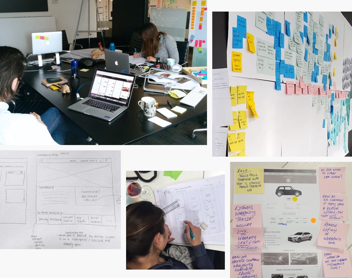
Following an initial period of UX pre-production - including dealership interviews, user journey mapping, archetype creation and Inspectlet reviews - I began work with the Service Designer and Content Strategist to determine the Information Architecture of the new MDP. In the end, we cut down the sitemap by over 60%, allowing for a less cluttered experience.
After finalising the IA, we then scamped and wireframed the entire website. These wires ranged from simple content pages to more complex data-driven tools. During this phase, we also ideated a lot of pro-active work, some of which has now been release post-launch.
CONTENT STRATEGY
Establishing the narrative
For larger, content-based platforms, having consistent and high-quality content is key. With a now completely revised the IA, we decided to create a content strategy to help stay true to our vision. At its core, this strategy dictated the look, feel and tone of Mazda.com.au.
It also provided a guide on how to handle inevitable content updates, with a set of simple questions to ask:
- Does this content already exist?
- What user problem does the feature solve?
- How does it work on mobile?
- Does the feature adhere to our guiding principles?
- Is the feature scalable/extensible?
- What is the ongoing expected maintenance of the feature?
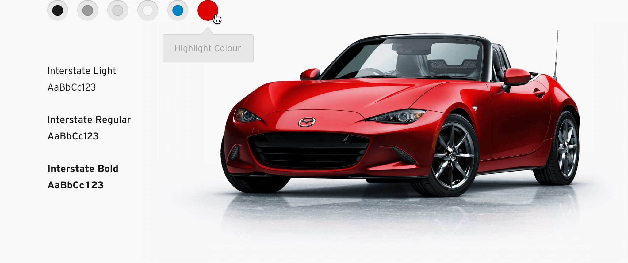
DIGITAL STYLE GUIDE
Making the physical digital
Mazda Australia has a well established visual identity. However, their existing brand guidelines were mainly focused on more traditional, above-the-line executions. So as part of our platform overhaul, I evolved the existing guidelines into a more suitable digital style guide, and gave Mazda a design language specifically tailored to the web.
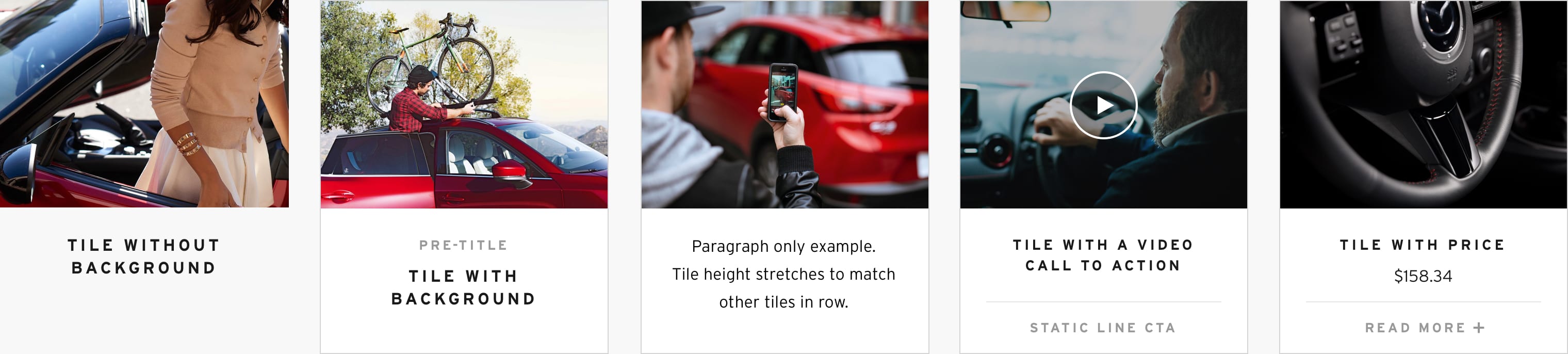
By taking a modular approach to the website, we were able to fluidly and rapidly set up pages in the CMS. Seen here is the same tile module, but by toggling certain options in the CMS (heading, paragraph, CTA, alignment and even background), we could achieve a large variety of layouts.
By taking a modular approach to the website, we were able to fluidly and rapidly set up pages in the CMS. Seen here is the same tile module, but by toggling certain options in the CMS (heading, paragraph, CTA, alignment and even background), we could achieve a large variety of layouts.
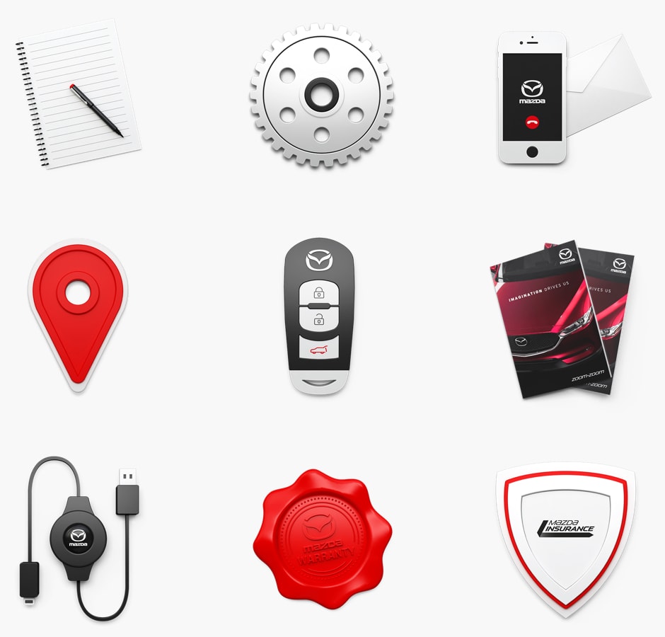
Long live Skeuomorphism
To accompany the high-quality product renders that are used frequently throughout the site, we created a set of 3D skeuomorphic icons to represent the key sections of the website - such as Build a Mazda, Find a Dealer, and MyMazda.
So what is it, and who is it for?
My Big Idea was a nationwide ideas competition focused on creating positive change for Australia. Taking the form of a digital hub, we asked Australians to submit ideas on ways to improve aspects of the country, based on what the community said it cared most about.
The top 100 ideas went to a judging panel, with 12 winners being brought to life with support from some of Australia’s leading organisations.
Adaptive Design
Designing for Context
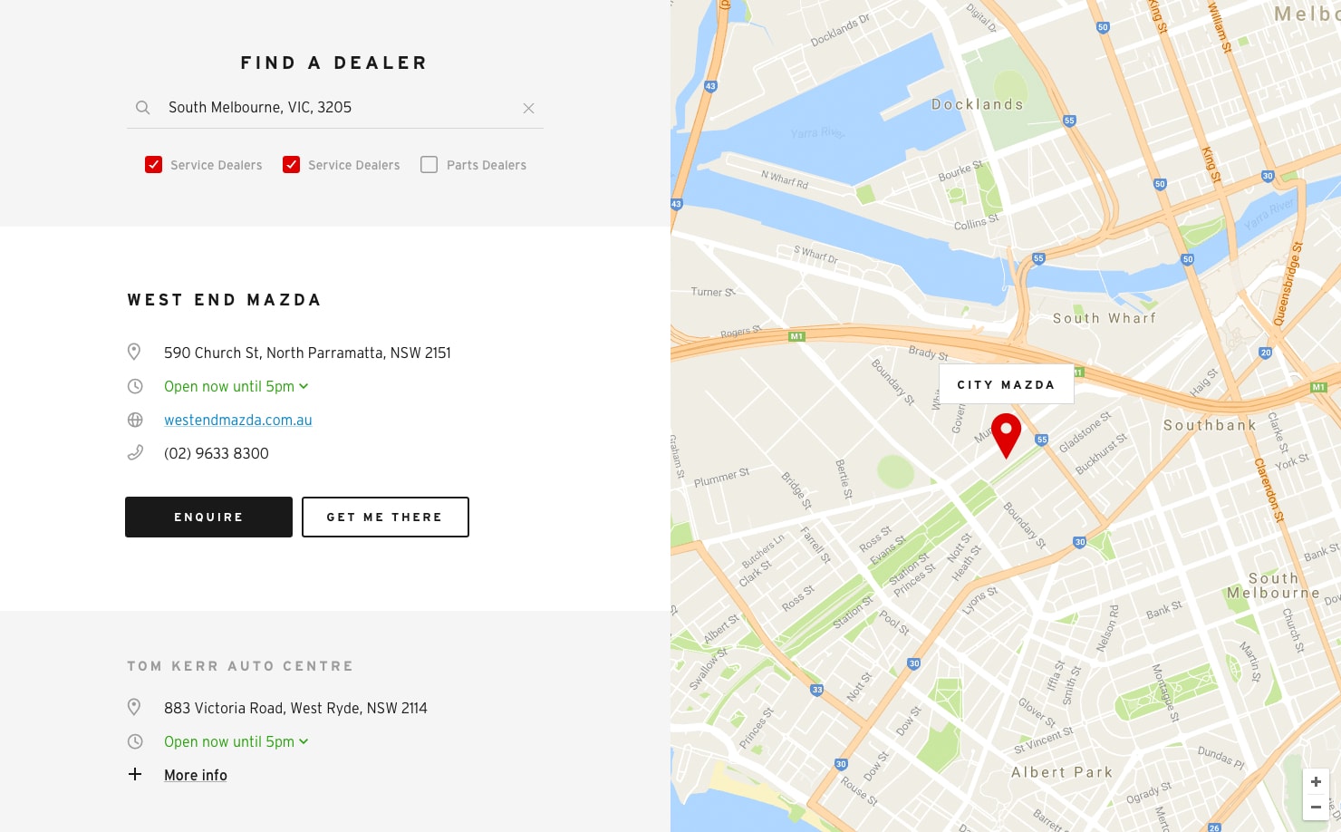
When designing a site the size of the Mazda.com.au, understanding user context is essential. Is the user viewing this page on a desktop, tablet or mobile? What are the user needs, and what task are they trying to complete? By mapping out the various user journeys, it became clear that strict responsive design would be too limiting.
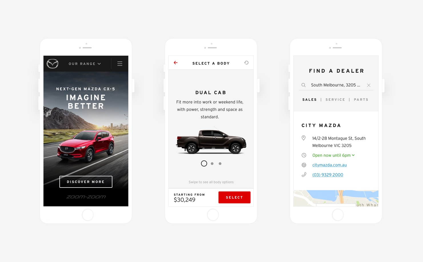
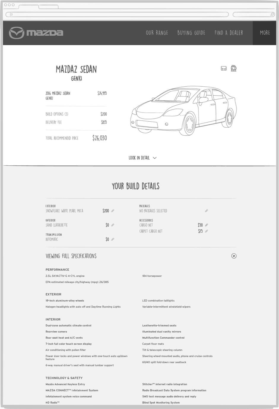
Instead, we decided to take an adaptive design approach. In practice, this meant content, copy and even UI may change to suit the current user context. For example, the "Build a Mazda" UI adapts on mobile devices to be better suited to touch + swipe interaction.
On Desktop, the "Build a Mazda" tool features slightly different UI elements that work better for traditional mouse interaction. Larger screen sizes also mean car imagery can serve a more interactive purpose.
On Desktop, the "Build a Mazda" tool features slightly different UI elements that work better for traditional mouse interaction. Larger screen sizes also mean car imagery can serve a more interactive purpose.
PERSONALISATION
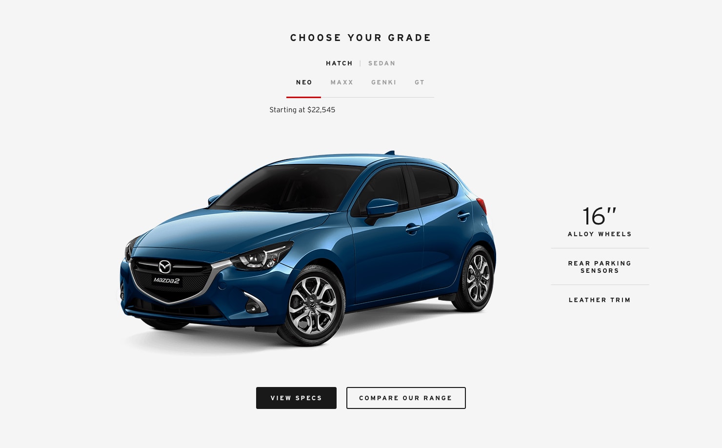
Vehicle Landing Pages
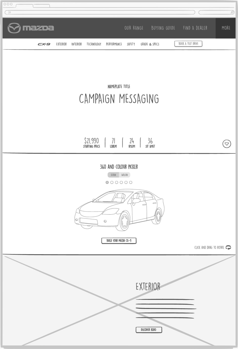
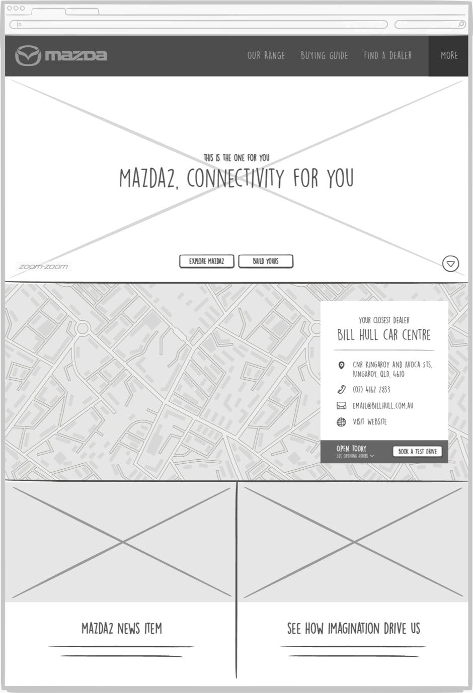
Vehicle landing pages are the source of all knowledge for each Mazda model. These pages hold a vast array of information, such as pricing, specs, model variations, colours, and tech features. On top of this, each page needs to communicate the unique personality of the vehicle. This look & feel is largely determined by a concurrent ad campaign or TVC.

With this in mind, we knew the vehicle pages were going to be content heavy. But with our adaptive design approach, we were able to use EpiServer personalisation to display a unique customised experience on any device.
Whether it meant rewriting paragraphs for mobile, providing re-cropped images for smaller screens, or removing/moving entire sections altogether - this content personalisation means the user only gets the most important content for their current context, and thus a more streamlined experience.
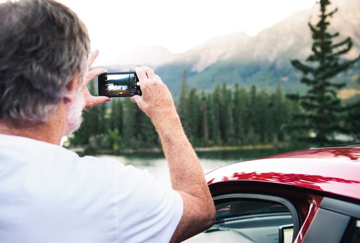
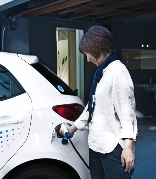
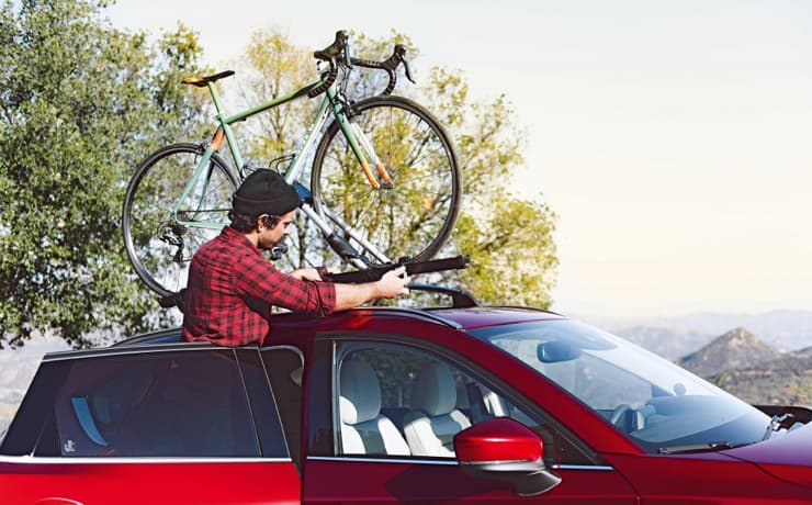
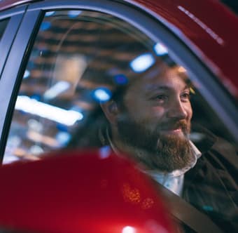
OWNERS IMAGERY
Making it human
With product-focused websites, it’s easy to lose a human touch. That's why one of my main goals when planning content was to make sure the site maintained a human element throughout.
On vehicle landing pages, where the focus should be on the car, people are subtly shown by their interactions with the car. For example, shots of a person with their hands on the steering wheel, or interacting with the infotainment system.
However, in the owners section, the emphasis shifts to instead be about how a Mazda fits into a persons life. By utilising more human-focused imagery we can show that ownership of a Mazda is a special experience that is enjoyable as it is easy.
PROJECT RESULTS
What did we achieve?
Following a successful launch in March 2017, the site went on to attract over 1.4 million visitors in the next three months alone. The overhauled platform brought Mazda into the future, and further cemented it as one of Australia’s top-selling car brands.
However, none of this could have been possible without such an awesome team. The best digital work comes about when UX, design, content, development and production all function cohesively, and I was fortunate enough to work alongside some extremely talented people on this project. And having great people definitely makes the late night content population go much faster. Here’s to us, team!
1000
ASSETS CREATED
0
DOGGIE MASCOTS
2000
COFFEES CONSUMED
See More Projects
My Big Idea
Engaging Australians to help shape our shared future

Defence Careers
Crafting a new digital identity and recruitment platform

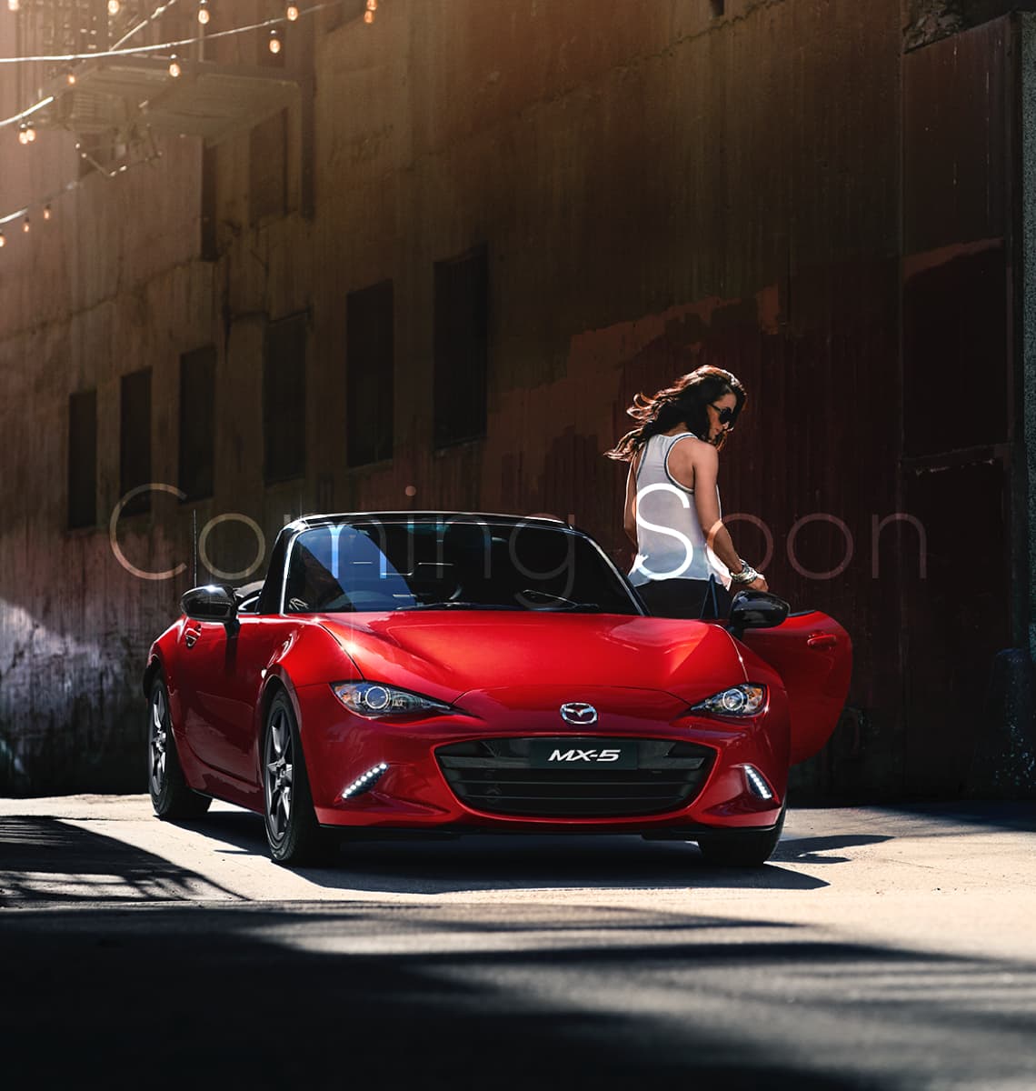 MX-5">
Like what you see? Want to know more?
Let's grab a coffee
Jenna Peppler © 2018